UX Principles Poster
This project was inspired by Yon Yablonski's well-known "Laws of UX" illustrations, which present a set of guiding principles for designing user-friendly interfaces and experiences. Taking that concept as a starting point, I decided to create my own abstract visual interpretation of these UX principles.
Tools
Adobe Illustrator Adobe InDesign
Type
Year
2024

Background
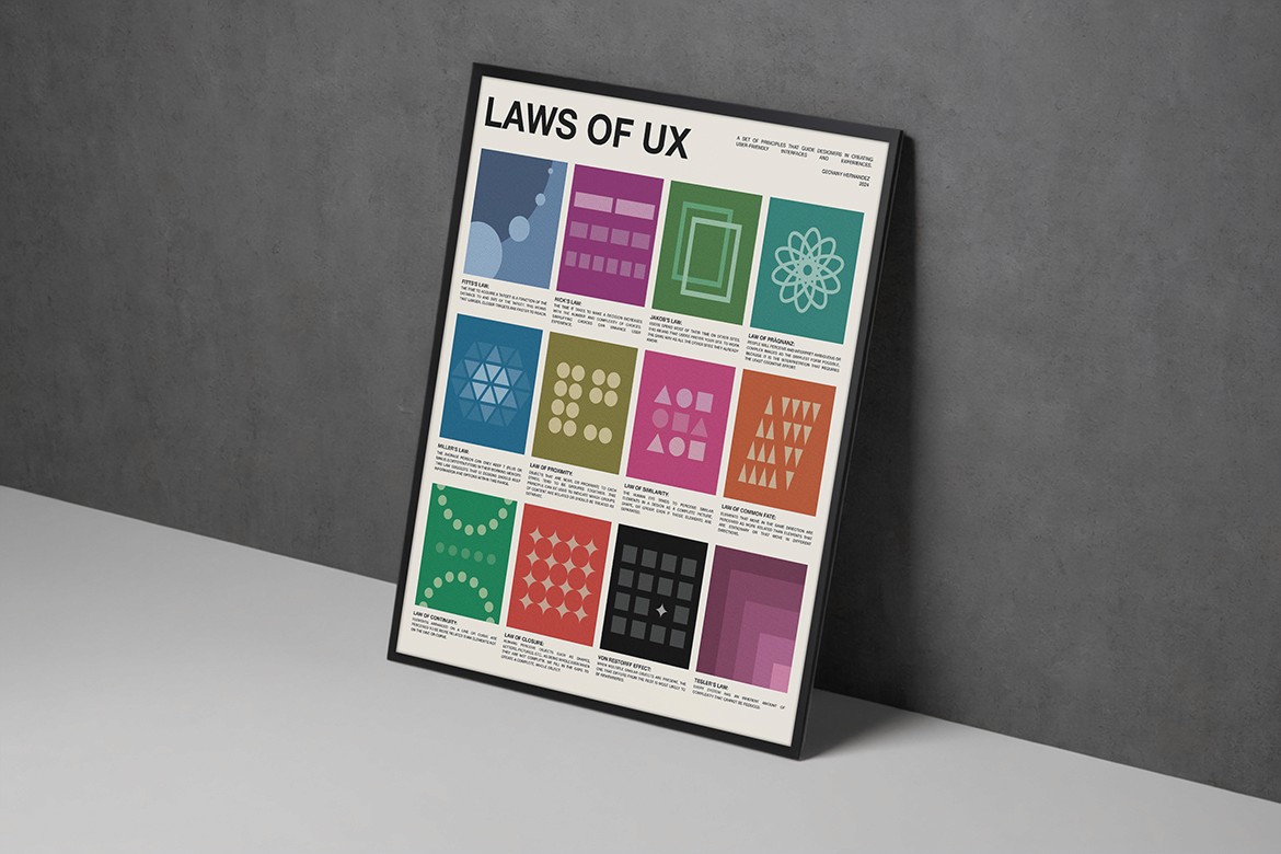
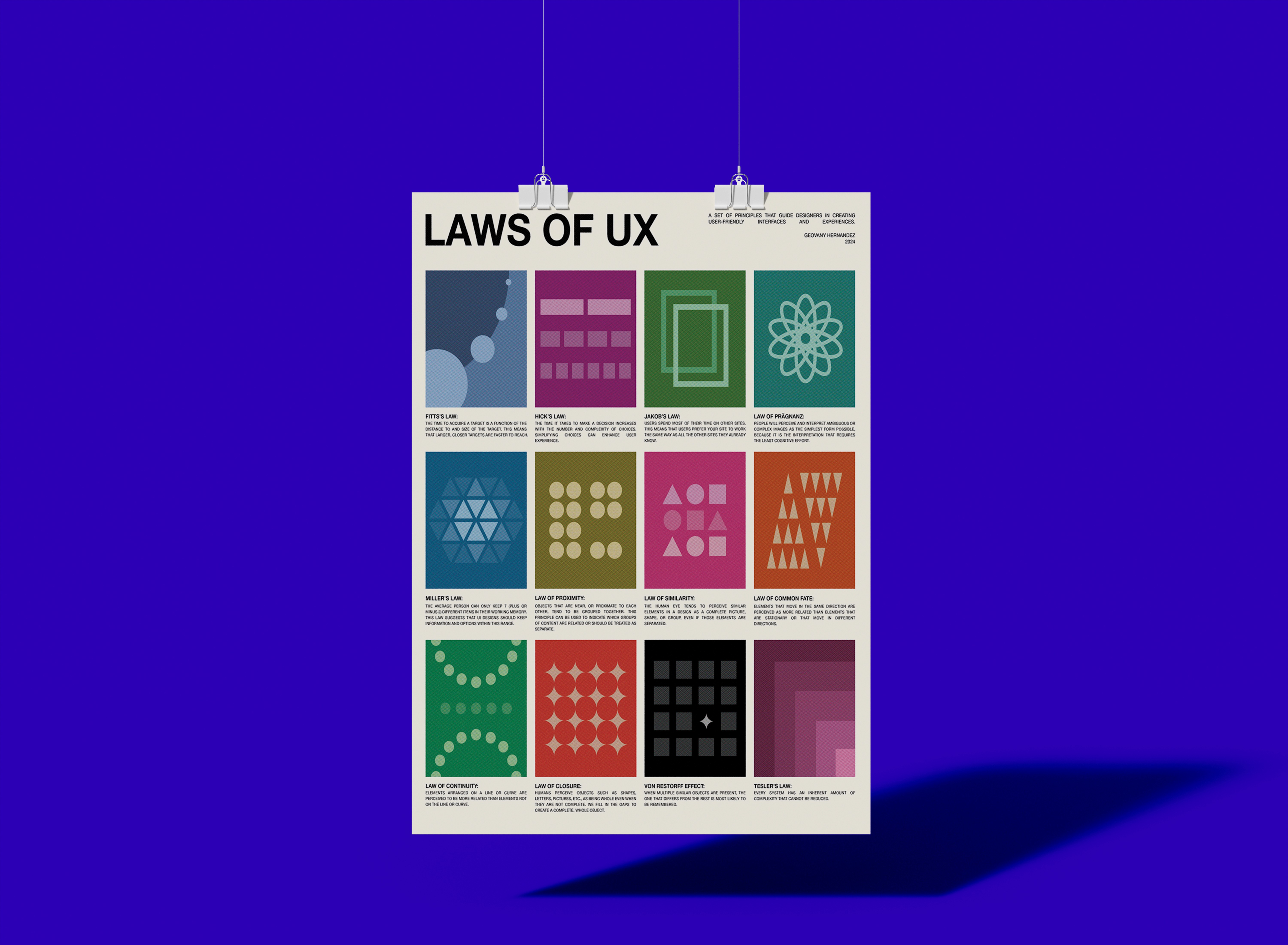
The goal was to develop a clean, eye-catching poster that could serve as a constant reminder of these important design guidelines. Drawing from the Swiss design aesthetic, I opted for a minimalist, grid-based layout that allows the individual illustrations to take center stage.
Development
Each square on the poster represents a different UX law or principle, from Fitt's Law and Hick's Law to the Law of Similarity and Von Restorff Effect. The abstract shapes and patterns within each panel are designed to visually communicate the essence of that particular principle in a memorable way.
By using a consistent color palette and typographic treatment, the overall poster maintains a cohesive, unified look while still allowing each individual illustration to stand out. This balance between coherence and distinctiveness is crucial for making the content easy to scan and digest.
Final Thoughts
Beyond just aesthetic appeal, this poster serves a practical purpose. I keep it displayed prominently on my desk as a constant visual reference, reminding me of these foundational UX concepts whenever I'm engaged in the design process. The clean, striking imagery helps these principles stay top-of-mind, informing my design decisions and ensuring I adhere to best practices.
Overall, this project allowed me to marry my passion for visual design with my deep understanding of UX principles. The result is a poster that is both aesthetically pleasing and functionally valuable, supporting my growth and reinforcing crucial design knowledge.


