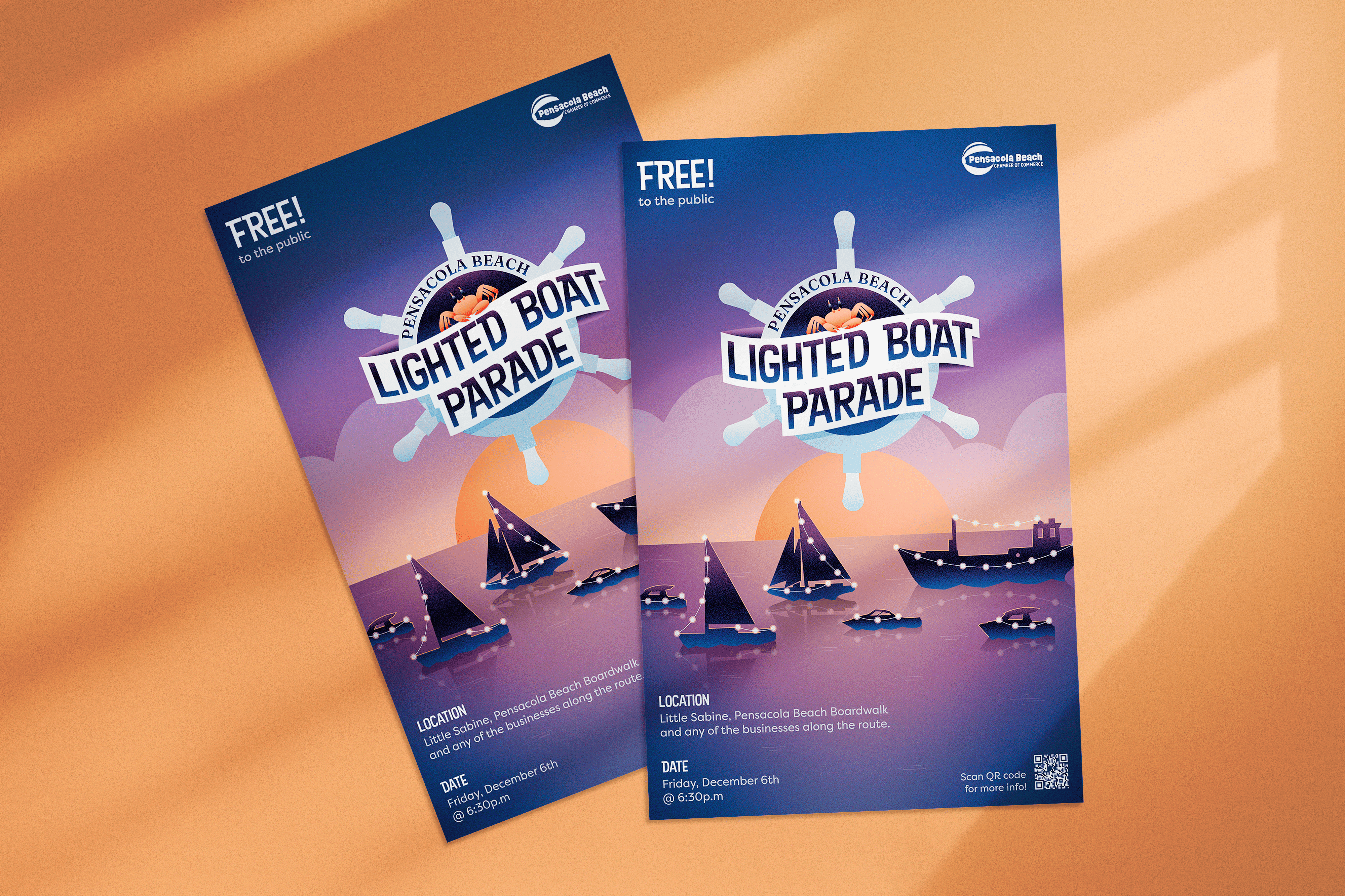
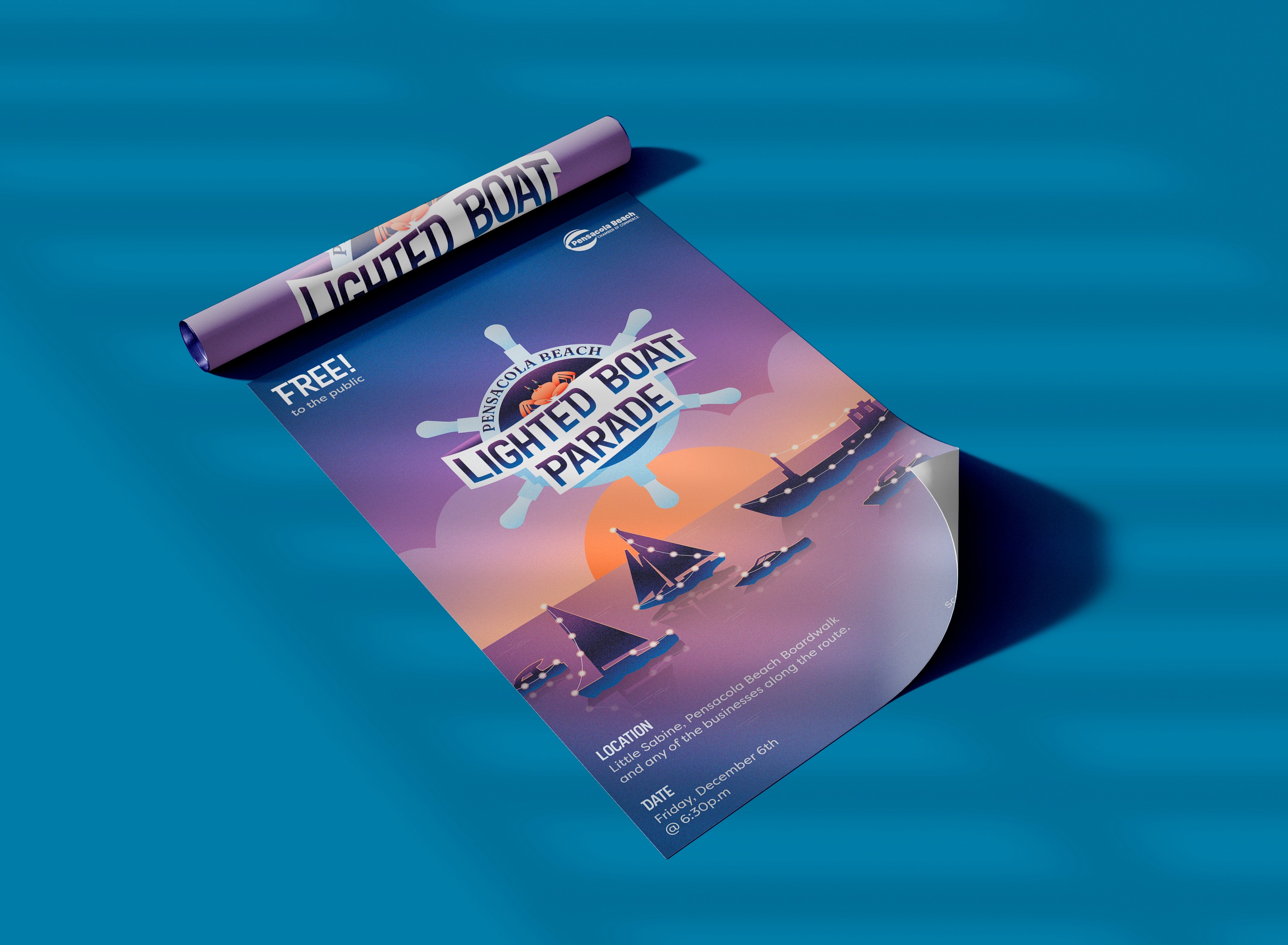
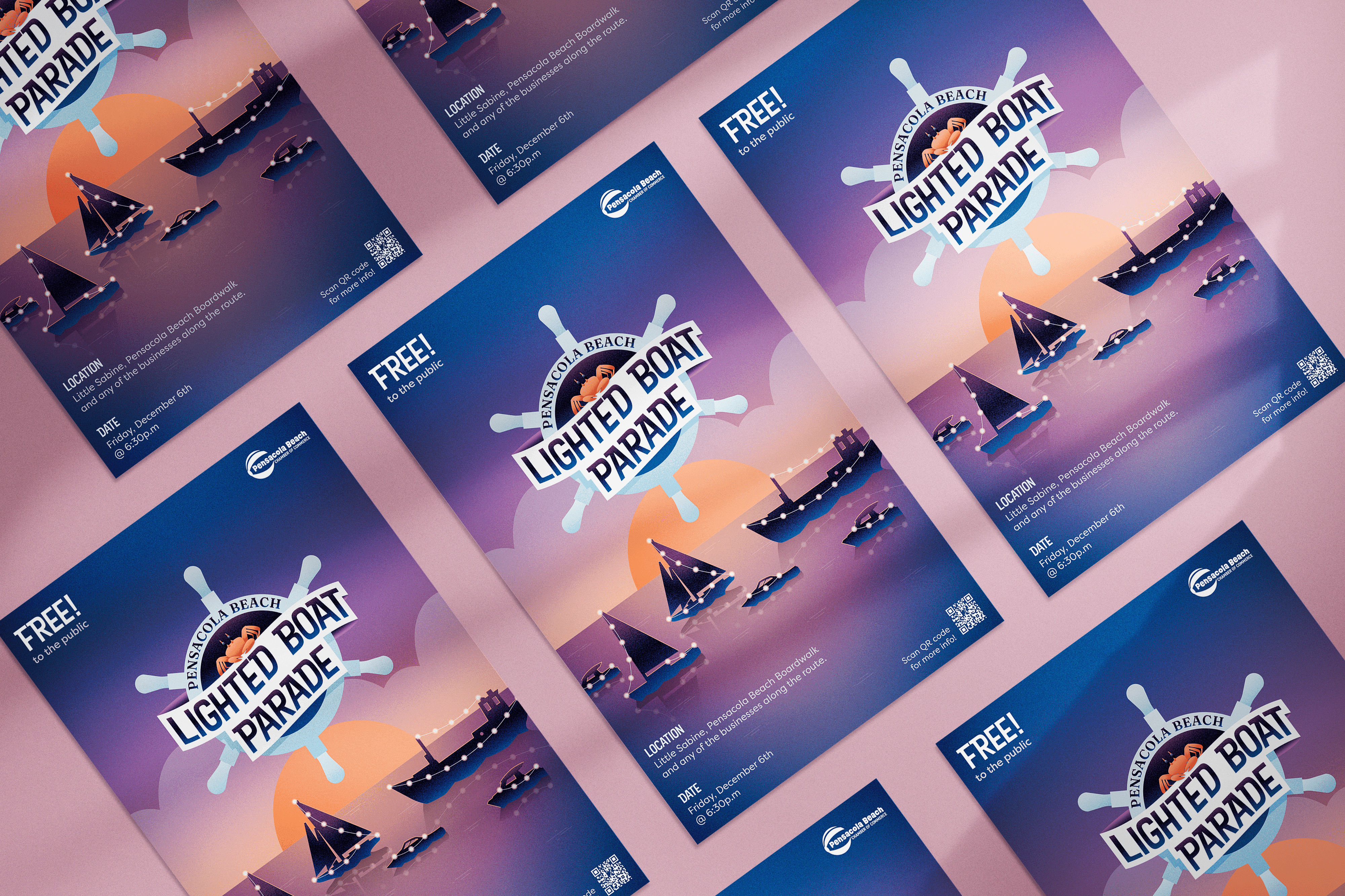
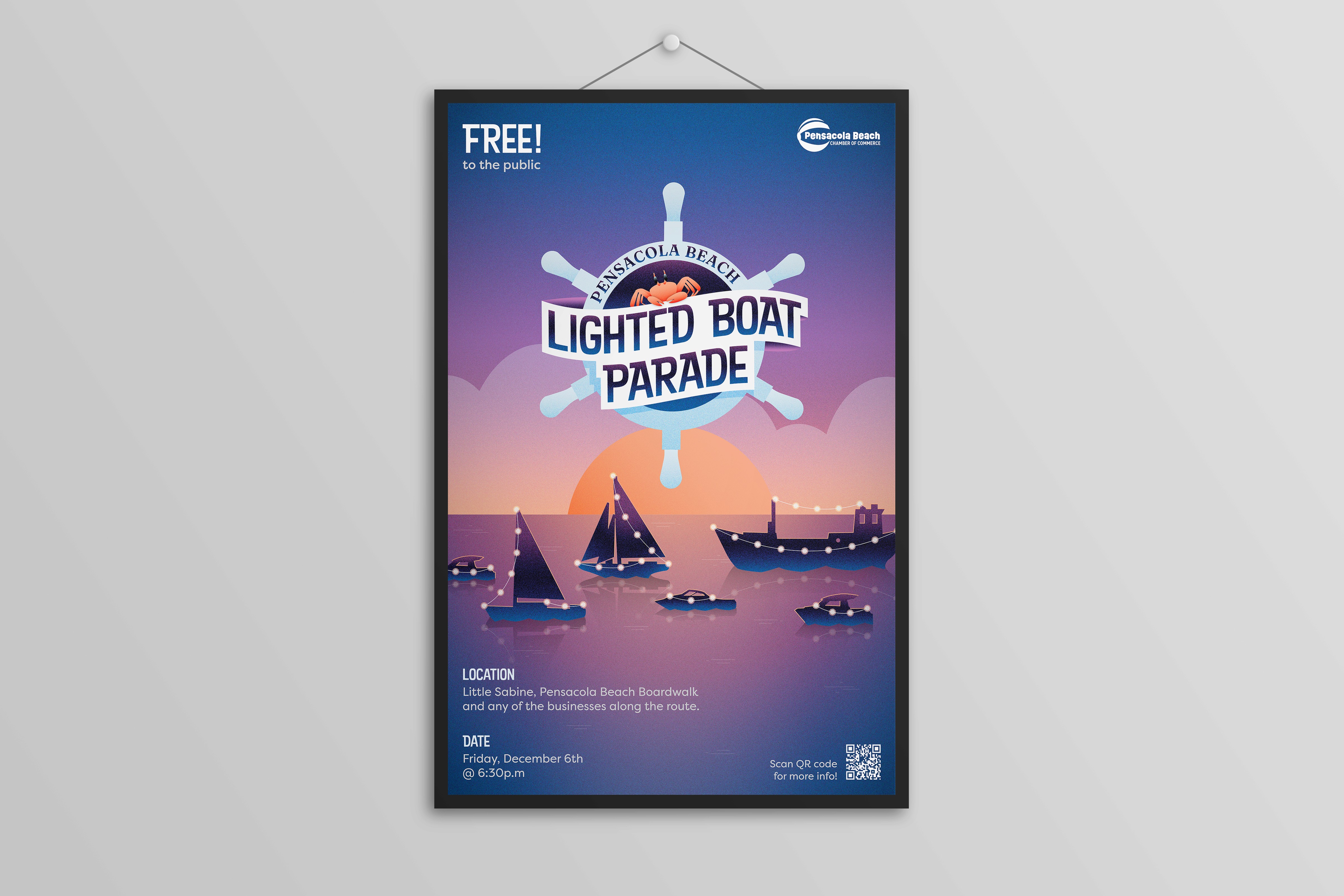
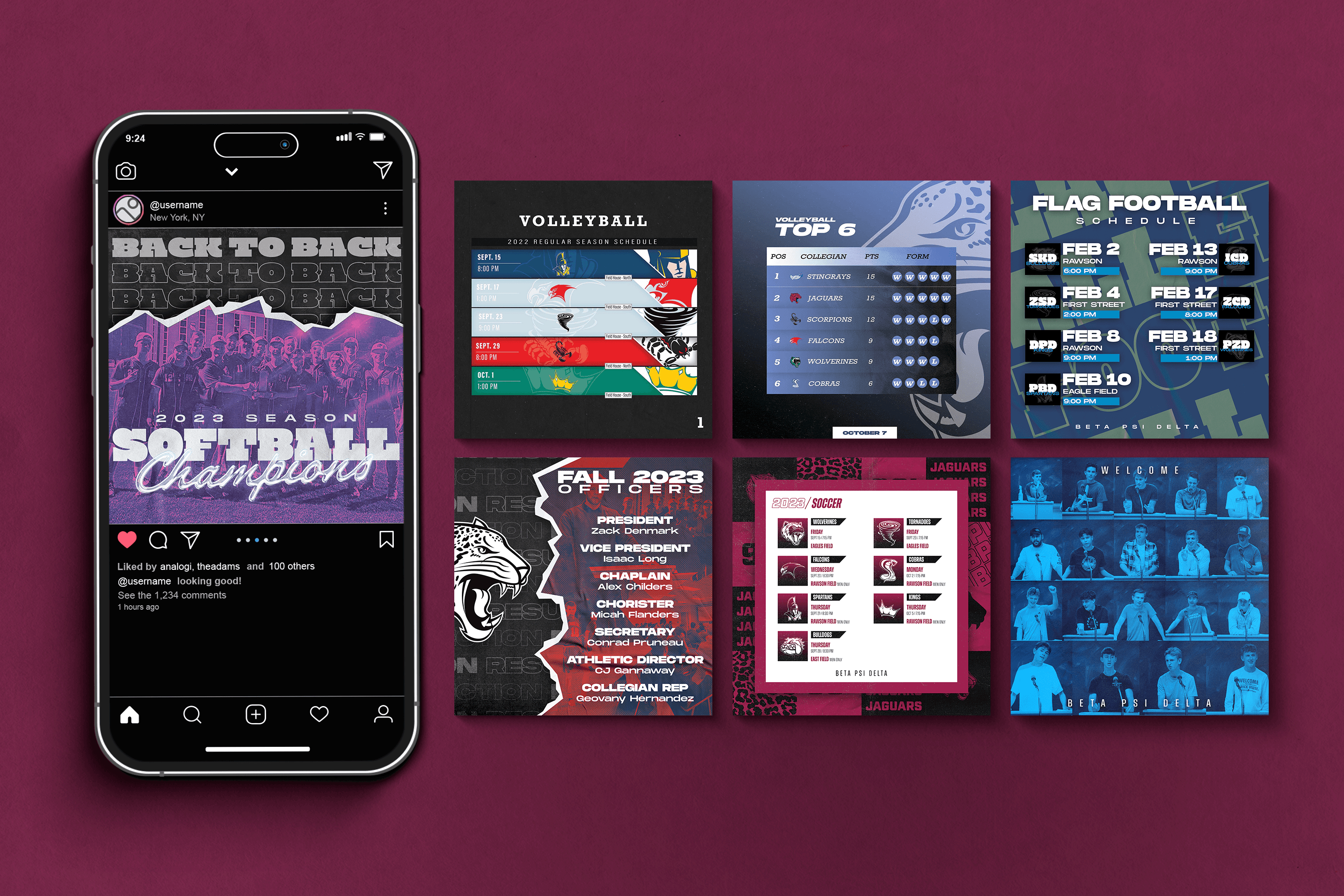
Lighted Boat Parade Poster
This project was completed as the final assignment for my Graphic Design I class, where we were challenged to create a poster that effectively communicated with a specific target audience while incorporating texture techniques in Adobe Illustrator.
Tools
Adobe Illustrator Procreate
Type
Year
2024
Background
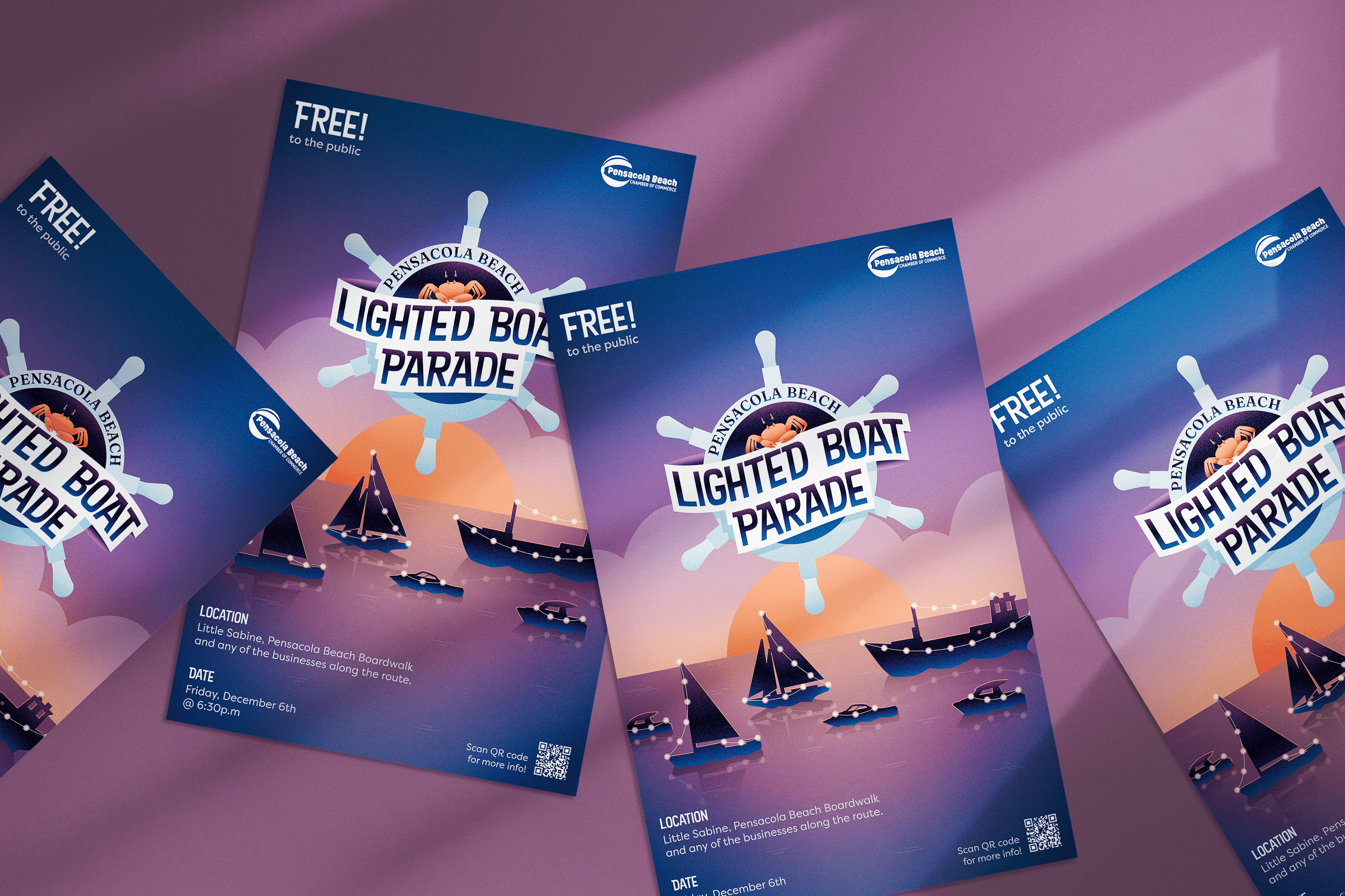
I chose to set the scene at dawn, which allowed me to work with a rich color palette of vibrant purples, blues, and oranges. These colors not only created a striking visual harmony but were enhanced by the textural elements I incorporated. The timing of dawn also provided a natural context for depicting the transition between darkness and light - a perfect metaphor for a lighted boat parade.
Development
After initial sketching and rough vector layouts, I developed a design approach that would strike a balance between polished professionalism and handcrafted charm. Drawing inspiration from artists on Pinterest, I implemented a grain/noisy gradient technique to add texture and depth to the composition, complemented by strategic use of shadows and lighting effects.
The simple graphic style I chose helped maintain clarity and impact while allowing the textural elements to add visual interest without overwhelming the design. This approach ensured the poster would be both eye-catching and effective at communicating the event's festive nature to its intended audience.
Final Thoughts
Through this project, I gained valuable experience in balancing various design elements - from color theory and texture application to layout composition and typography - while maintaining a clear focus on the project's communication goals. The process of moving from initial sketches to final execution helped strengthen my understanding of how different design elements work together to create a cohesive and engaging piece.
