Mobile Order Redesign
The campus Mobile Order app serves thousands of students daily, facilitating food orders from various campus dining locations. While functional, the existing interface presented unnecessary friction points and missed opportunities for engagement.
This redesign focuses on streamlining the ordering process while introducing modern features that enhance the overall user experience.
Tools
Figma
Type
App Design
Year
2023

Background
User Pain Points Identified:
Multiple screens required to complete a simple order
Limited visual engagement with food items
Lack of user retention features
Outdated interface design
Complex navigation structure
Key Objectives:
Streamline the ordering process
Modernize the visual design
Improve user engagement
Enhance navigation efficiency
Add value-adding features
Process
The redesign introduced several significant improvements:
Streamlined Interface:
Reduced number of steps to place an order
Implemented a clear visual hierarchy
Added high-quality food imagery
Integrated calorie information for informed choices
New Features:
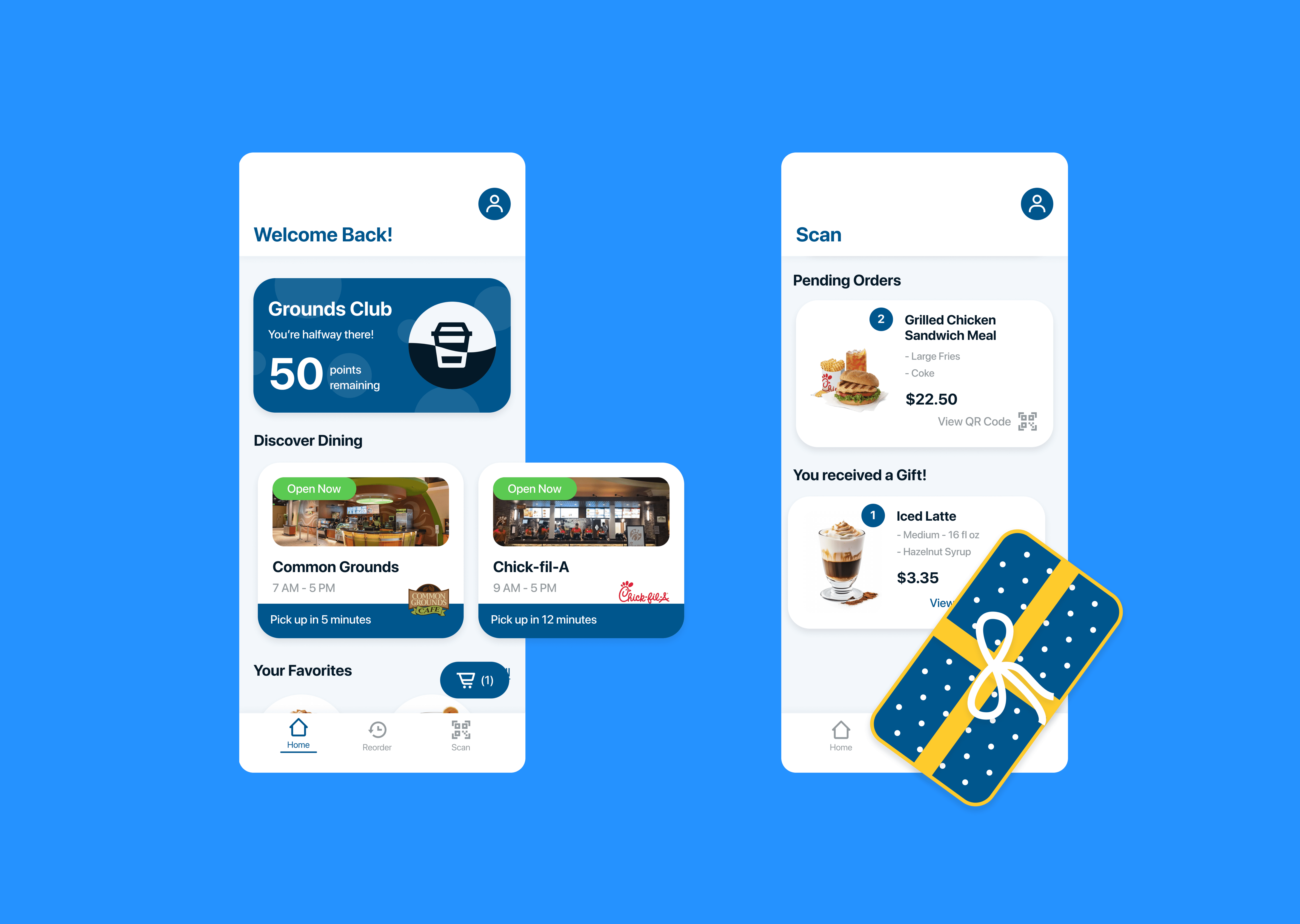
"Grounds Club" rewards program for customer retention
Gift-giving functionality for peer-to-peer engagement
QR code-based pickup system for efficient order collection
Reorder capability for frequently purchased items
Enhanced Navigation:
Optimized bottom navigation bar focusing on core functions
Replaced hamburger menu with an intuitive profile modal
Clear status indicators for order progress
Simplified reorder process from order history
Final Thoughts
This redesign successfully modernized the Mobile Order experience while maintaining familiarity for existing users. Key achievements include:
Reduced friction in the ordering process
Improved visual appeal using institution's brand colors
Added social features like gifting
Implemented loyalty program for retention
The project demonstrates how thoughtful UX improvements and modern design patterns can transform a utilitarian app into an engaging platform that better serves its student users.


