


World Geography Interactive
Web Application Design
Designing a flexible geography teaching platform for classrooms and homeschool environments.
Role
UX/UI Designer
Front-End Developer
Timeline
2 years
Project Type
Web-Based Educational Interactive
Tools
Figma
Cursor
Background
A new World Geography curriculum required a digital teaching companion.
Problem
Teachers relied on separate physical maps that could not be combined or customized during lessons.
Solution
Designed a layered map platform with annotation tools and customizable overlays.
Outcome
Reduced map production time by 50%, reduced interactive creation time by 85%, and received overwhelmingly positive teacher feedback.
Problem
Why Build It?
The project began when the HESS (History, English, and Social Studies) curriculum team approached us with an ambitious vision.
They imagined:
Interactive globes
Real-time geographic data
Complete teacher control
Highly immersive experiences
At the same time, teachers were already expressing frustrations with the existing workflow. A typical geography lesson required multiple physical maps: Political maps, Physical maps, Border maps, Longitude & latitude map. Teachers could switch between them, but they couldn't combine them.


Opportunity
Teacher feedback revealed a consistent desire:
Give us the ability to mix and match information based on the lesson we're teaching.
Some teachers even suggested transparent overlays as a possible solution. This insight became the foundation of the project.
Research
Understanding Classroom Workflows
To better understand how geography was taught, I began thinking from a teacher's perspective. My mother is a teacher, which gave me familiarity with classroom workflows. To validate assumptions, I spoke with teachers throughout the building and collected lesson activities they regularly used.

Understanding Classroom Workflows
After gathering responses, I organized them into recurring categories.
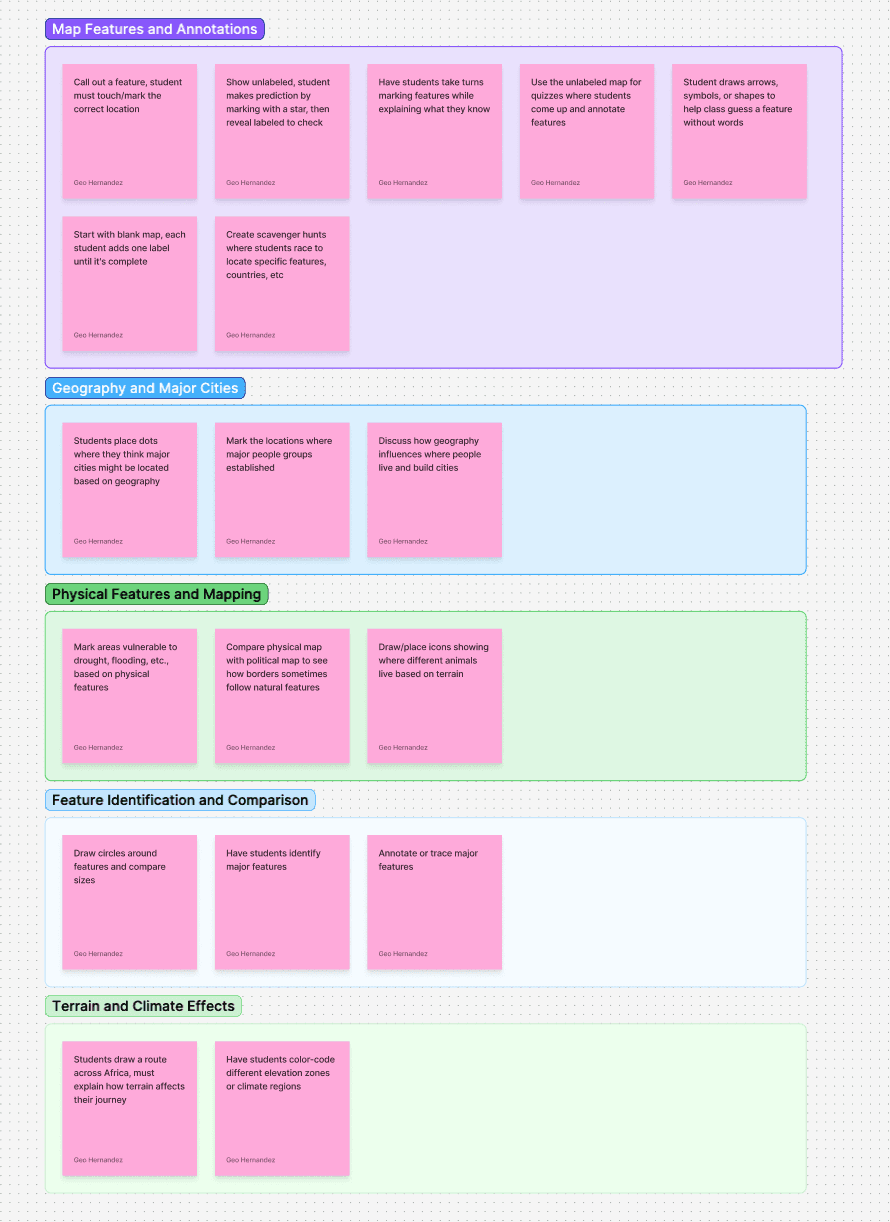
The activities consistently clustered around:
Key Insight
Teachers weren't asking for more information. They were asking for more flexibility.
Constraints
Technical Constraints
Abeka products must:
01
Work offline
02
Run across all supported devices
03
Remain stable for long classroom sessions
This immediately eliminated many stakeholder ideas involving live geographic data.
Content Constraints
The maps needed to:
01
Match curriculum exactly
02
Align with textbook content
03
Support teacher lesson plans
Educational accuracy took priority over visual novelty.
Business Constraints
The team needed a solution that was:
01
Maintainable
02
Scalable
03
Easy to update
Future curriculum revisions could not require rebuilding entire experiences.
Key Design Decisions
Decision #1
Globe to Layered Maps
Stakeholder Vision
3D globe
Live geographic data
Highly immersive interactions
Challenge
Existing tools already provided those experiences. Building another version would add complexity without solving the teacher's core problem
Solution
A layered map system

Why?
Enable borders
Show political regions
Reveal capitals
Toggle longitude & latitude
Combine multiple layers simultaneously
Outcome
A simpler system that directly supported classroom instruction.
Decision #2
Curriculum Fidelity Over Novelty
Rather than creating entirely new maps, we built around the exact maps used throughout the curriculum.
This ensured consistency between:
Books
Lessons
Interactive activities
Outcome
Students encountered the same visual language across every learning environment.
Design Evolution
Phase 1: Defining the MVP
The project began as a collaborative effort between three designers. Our goal was to determine the minimum feature set capable of supporting the new curriculum while remaining technically feasible.


What We Learned
The maps solved the layering problem but lacked support for active classroom instruction. Teachers could view information. They couldn't meaningfully interact with it.


Project Pause
The project was temporarily halted after the third-party map assets failed to meet curriculum standards. During this period, the team was reassigned and development stopped for approximately one year.
When the project resumed, I became the sole designer responsible for its direction and implementation.
Phase 2: Designing for the Classroom
With the product back in development, I revisited the experience through a different lens. Instead of focusing on maps, I focused on teachers.
Through conversations with educators and workflow research, I identified a broader need:
Teachers didn't just need map layers.
They needed tools to teach with those layers.
This insight fundamentally changed the direction of the product.
Visual Refinements


Teacher Tools
After the project resumed, I revisited the product from a new perspective
Instead of asking:
What should the map do?
I asked:
What would a teacher want to do during class?
Annotation Toolkit
Inspired by tools such as: Figma, FigJam, Miro. I designed a classroom-focused annotation system.
Drawing Tool
Teachers can: Draw freely, Adjust color, Change stroke size, Erase annotations
Text Tool
Allows instructors to add custom lesson information.
Pins
Place markers anywhere on the map.
Shape Builder
Highlight regions and create custom learning exercises.
Outcome
Reduced interface complexity while keeping advanced functionality accessible.
User Testing
The toolbar originally lived at the bottom of the screen. Testing revealed a problem. Teachers felt it blocked important map content. As a result, the toolbar was moved to the side.
Internal Tools
Existing Workflow
One of the biggest problems wasn't the classroom experience.
It was content production. Creating a single interactive required:
01
Exporting InDesign assets
02
Converting images
03
Encoding assets manually
04
Editing code
05
Updating titles
06
Updating icons
The process took approximately:
20 Minutes Per Interactive
Additional Problem
Map legends were baked into images. This created: Maintenance issues, Zoom limitations, Additional design work
Solution #1
Dynamic Map Legend
I moved legends into the interface itself.
Benefits:
Scales with zoom
Easier updates
Reduced production work


Outcome
Reduced map production time from:
3 days
1.5 Days
Solution #2
Interactive Builder
I designed and developed a map builder that allows creators to:
Bulk upload map assets
Rename layers
Add new layers
Remove layers
Configure map legends
Update metadata
without touching code.
Outcome
Reduced setup time from:
10 Minutes
1 Minute
Validation
Throughout development, teachers reviewed prototypes and provided feedback. The response was overwhelmingly positive.
Key Findings
Comments included:
"This is everything we've ever wanted."
and:
"I wish I could go back to teaching just to use this."
Key Findings
Finding 1
Flexibility mattered more than visual novelty.
Finding 2
Annotation tools became core workflow features.
Finding 3
Layer combinations supported a wider range of lessons than static maps.
Impact
Teacher Impact
Teachers can:
Combine map types
Annotate lessons live
Create custom learning activities
Adapt maps to classroom needs
Organizational Impact
Reduced map creation workflow:
3 days
1.5 Days
Reduced interactive setup workflow:
10 Minutes
1 Minute
Product Impact
Created a scalable framework capable of supporting future geography content.
Reflection
What I Learned
The biggest lesson from this project was that innovation isn't always about adding more technology.
Initially, the vision centered around:
3D globes
Live data
Complex interactions
But teacher research revealed a different need. What users actually wanted was flexibility.
By focusing on classroom workflows rather than technical novelty, we created a solution that was easier to maintain, easier to teach with, and more valuable to instructors.
Next Project